BLOG
Why Your Website Visitors Bounce and How to Make Them Stay
Picture this: You go to work one day, pull up your website’s daily visitor count and are floored to learn that over 500 people made it to your site yesterday. You’ve topped your record and you feel confident that the word about your business is finally getting out.
Why Your Website Visitors Bounce
But then you look at your bounce rate and it’s sitting at 45 percent. That means of the 500 people who visited your site, 225 visitors only stayed on your site for a few seconds before clicking out. They might have closed their browser, realised your site was not what they were looking for or just lost interest. There are a number of different reasons why people leave websites so quickly, and while 45 percent is not at all ideal, it’s not the worst. There’s lots of room to work.
[twittee tweet=”What you need to do is improve your #websiteconversion. @geetztweetz” content=”What you need to do is improve your website conversion.” balloon=”Click link to Tweet this!” position=”topMiddle” theme=”light” id=”001″ ] Not sure what that is or where to start? Never fear, we’ve got the low-down on website conversion, the best ways to track it and how you can better optimise your website so you can finally see why your website visitors bounce and how to keep them on your site longer.
The Basics
So what, in its simplest terms, is website conversion? Website conversion is the process of getting users to stay on your site and do whatever it is you want them to do. A blog might want more subscribers. A retailer wants visitors to become consumers. Website conversion means getting website visitors to do one or more of the following actions:
- Buy a product
- Register for an upcoming webinar
- Fill out a lead or contact form
- Download a whitepaper
- Sign up for your weekly/biweekly/monthly/whatever newsletter
[twittee tweet=”The more visitors who complete these tasks, the better your leads will be #websiteconversion. @geetztweetz” content=”The more visitors who complete these tasks, the better your leads will be” balloon=”Click link to Tweet this!” position=”topMiddle” theme=”light” id=”tw02″ ], and your salespeople will be able to close more sales.

Photo: CC BY 2011 NHS Confederation
Website conversion is measure by a percentage of your visitors. While an ideal rate varies depending on each industry, business-to-consumer (B2C) websites that sell necessary items (think shampoo, deodorant and other items you use every day) usually average above 15 percent while non-necessary items (such as designer shoes or video games) are at about 1 to 4.5 percent. Business-to-business (B2B) rates often average somewhere between five and eight percent.
This means that this percentage of visitors to these websites are filling out forms or signing up for newsletters. The percentages may look smaller, but let’s say a B2C essential-item selling site averages about 40,000 visitors per day, that’s 6,000 strong leads or 42,000 leads per week.
[twittee tweet=”The bottom line is that you have to present your visitors with a call to action. #websiteconversion. @geetztweetz” content=”The bottom line is that you have to present your visitors with a call to action.” balloon=”Click link to Tweet this!” position=”topMiddle” theme=”light” id=”tw03″ ] Give them a good reason to buy from you or sign up for your webinars, and you’ll see your bounce rate sink lower and your conversion rate grow bigger as your sales begin to grow as well.
How to optimise your website conversion
Now that you know what website conversion is, how it’s measured and why it’s so important, let’s now discuss how you can go about improving your website’s rate. There are so many different tools and programs out there that will help you design a good website and get usable feedback to see if users found your site as easy to navigate.
Most SEO experts divide the most popular conversion tools into one of three categories: user testing, concept testing or attention and click testing. Though they all work slightly differently, they are all dedicated to helping you design a better website and predict how well it will improve your conversion rate.
User Testing
[twittee tweet=”Let\’s face it: you don\’t always know what your customer wants. #websiteconversion. @geetztweetz” content=”Let’s face it: you don’t always know what your customer wants.” balloon=”Click link to Tweet this!” position=”topMiddle” theme=”light” id=”tw04″ ] Though you agonise over it at times, there simply isn’t a way to be 100 percent sure that your site is everything your users need, but with user testing tools, you can sure come close. These tools help you see if your site is formatted in a way that visitors will find useful and easy to navigate, and you can test out any ideas for conversion funnels you have.
- Feedback Army ($20): Feedback Army is known for its quick turnaround time. You can post images of your website’s design and get almost instant feedback on the layout and flow of it. By submitting questions, you’ll get 10 responses back from the army of reviewers.
- Morae ($1,495 for whole software suite): Don’t let the price get you down. This software program comes in three parts: Manager, Observer and Recorder. With the Recorder software alone, you can record the audio, video, any on-screen activity and the keyboard and mouse movements. With the other programs in the suite, you’ll be able to see your website from so many different angles.
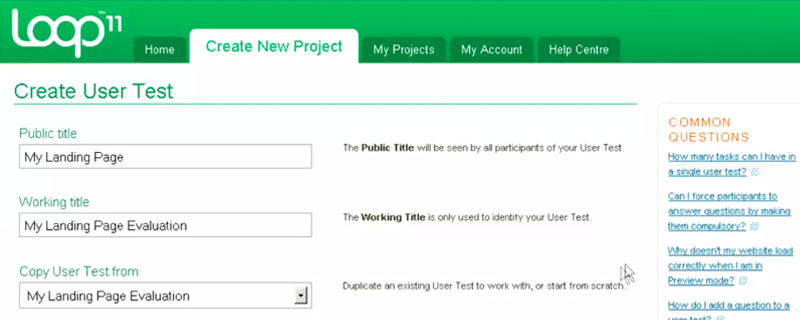
- Loop11 ($350 per project or $1,900-9,900 per year): What’s unique about Loop11 is that it is self-serving. You have complete control over posting your website and providing tasks and questions for your reviewers. You might ask them to go through the checkout process or sign up for a newsletter. Their feedback will help you see whether or not your website flows as well as you think it does.

Loop11 demo
Concept Testing
[twittee tweet=”The goal of concept tools is to provide a place where you can test your own ideas #websiteconversion. @geetztweetz” content=”The goal of concept tools is to provide a place where you can test your own ideas” balloon=”Click link to Tweet this!” position=”topMiddle” theme=”light” id=”tw05″ ] for a page layout as well as the layout for a whole site. You can create your own mock-up of a site and then let potential users, clients and co-workers provide feedback. With their comments you can then go about fixing the site and making it as best as it can be
- Markup (Free): This nifty site lets users actually draw on a live website, which makes it easier for you to share your ideas with designers. The images can be saved to your computer and sent out to other designers or clients.
- OmniGaffle ($99.95+): This program, which is for Macs only by the way, endows you with the ability to fine tune a wireframe, process charts or create diagrams. It makes it easier to quickly lay out the website’s structure. You can create whole website designs or single pages.
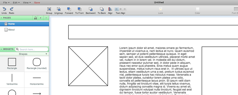
- Mockingbird (Try for free, plans from $9 and up): This shared program gives your team all the tools it needs to create designs, link them together, preview and then share website designs. You’ll have everything right at your finger tips.

Trying out Mockingbird
Attention and Click Testing
[twittee tweet=”Grabbing a visitor\’s attention can be the most important and most difficult aspect of website design. #websiteconversion. @geetztweetz” content=”Grabbing a visitor’s attention can be the most important and most difficult aspect of website design. ” balloon=”Click link to Tweet this!” position=”topMiddle” theme=”light” id=”tw06″ ] These tools are best for trial and error. You can test out different styles to see what is keeping visitors interested and see what is turning them away. You can also test how well you’re getting people to perform the actions you want.
- Attention Wizard (Free and paid subscriptions from $27-197): This great program lets you upload an image of a website or an actual live site, and the program will create what they call and “attention heatmap.” Simply put, they’ll show you were they think visitors are being attracted to on your website, which will help you decide where to post buttons, images or links.
- Google Browser Size (Free): Now that this site is available with Google Analytics, you can do so much more. Google Browser Size lets you make your own diagrams of different browser sizes so you can easily see where your “call-to-action” part is available to viewers without having to scroll around the page. This will help you see how many visitors are actually viewing what you want them to see.
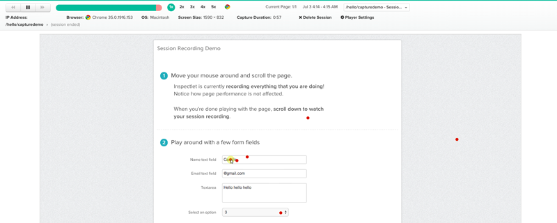
- Inspectlet (Free and paid packages from $9.99-199.99): What makes Inspectlet so awesome to use is that it combines heatmaps, screen captures and analytics. You can create your own heatmaps and see what your visitors see, all while getting analytics to help you see where you visitors are going.
Of course, before you go with any testing tool, always do your research and determine which tool is going to give you exactly what you want.

Trying out Inspectlet capture
How to keep visitors on your site
Website design can only go so far. You still need to give you visitors a good reason to stay on your site so they can remain long enough to want to sign up for newsletters and webinars or purchase your goods and services. After all that work of gathering feedback and redesigning your website, you might be wondering what more you could possibly do.
Here are a couple of website ideas that will keep users on your site.
1. Keep your content up-to-date and readable
[twittee tweet=”If you don\’t already have a blog on your website, put one up. #websiteconversion. @geetztweetz” content=”If you don’t already have a blog on your website, put one up.” balloon=”Click link to Tweet this!” position=”topMiddle” theme=”light” id=”tw07″ ] You should be routinely blogging and posting new content to attract new readers and keep past readers coming back for more. Google also rewards sites who post new content regularly by pushing them up higher in search results. You’ll have more regular visitors and be more visible to new visitors searching for you.
Don’t forget that readability is very important in a blog, as well as anywhere that text appears on your site. If your visitors can’t get through the text, they’ll just click off your page so remember these tips:
- Paragraphs should be short and sweet, two to five sentences long at best
- Section out your content with subheads to guide readers
- Use numbered or bullet lists that will stand out to visitors
- Bold or italicise words, but be careful not to go overboard
With all of this emphasis on blogs, it’s also important that you…
2. Use different multimedia formats
Videos and images tend to capture a visitor’s attention, and if you can keep them long enough, you just might convert them. [twittee tweet=”While many visitors like reading blogs, others prefer visual images #websiteconversion. @geetztweetz” content=”While many visitors like reading blogs, others prefer visual images” balloon=”Click link to Tweet this!” position=”topMiddle” theme=”light” id=”tw08″ ] to tell them why they should care or be interested.
From videos to slideshows to podcasts, there are lots of different ways to interest all sorts of visitors. As you experiment, you can measure the success of each media format and see what is working best for your viewers. Once you’ve found a good match, start focusing a little more heavily on it.

3. Keep users internal with links
When you’re on Buzzfeed or your local news outlet’s website, they probably have a list of internal links either along the side or at the end of the article. These internal links lead to other pages on the site you might be interested in, and their usually within the same topic or genre.
It’s important to keep visitors on the site, so by offering new material, you can let your visitors browse all your great content. Without links to other related articles or content, your visitors will take what they came for, maybe an answer to a question, and then take their business elsewhere. You can also install a “Related Posts” plugin that will automatically generate links to content within your site that closely relates to the article the visitor is already reading.
Beware. Many websites use this opportunity to keyword-stuff their links with SEO phrases. Keep all links as natural sounding as possible. If you’re linking to other articles, just use the name of the article.
4. Make the call to action obvious
We spoke briefly about a call-to-action earlier, but let’s return to this topic and flush it out more fully.
Remember that the overall goal is to convert visitors into leads by getting them to do a number of actions from buying a product or signing up for a newsletter. Sometimes the best way to get people to do these things is to just tell them. [twittee tweet=”No consumer is a mind reader #websiteconversion. @geetztweetz” content=”No consumer is a mind reader” balloon=”Click link to Tweet this!” position=”topMiddle” theme=”light” id=”tw09″ ] so go ahead and ask them to please complete a task. Many blogs end with a question, prompting visitors to leave comments and interact with the author.

Some sites require that all visitors register before viewing any content on the site. Forcing a visitor to complete a form will only drive them away, but those that do go through with the form are probably strong leads. At any rate, it’s not worth it to drive away potential customers so soon by making them act. Let them come to it naturally.
We’ve covered a lot of ground here, and there’s still a lot more we could talk about. What questions do you have about why your website visitors bounce? We’re here to help.
An overview of the Content Experiments feature in Google Analytics.


