BLOG
17 Business Website Mistakes that Push Your Customers Away
As a business owner, you probably have a million different ideas for how you want your website to look, but did you know that even the smallest design preferences can negatively impact your customer’s experience?
Remember, your website’s number one goal is to take your customer fluidly from browsing to purchasing without getting lost in the design. If you’re not reaching your desired sales goal, despite your awesome marketing efforts, it might have something to do with your website’s design.
Here are 17 business website mistakes that could be deterring your customers.
1. No way to search: Customers might know what they want the minute they land on your page, and having a search bar will directly lead them to what they want to purchase. Those without a search bar will run the risk of customers getting too fed up having to wade through all of your pages to finally find what they want.
2. Awful readability: If you ever saw a website written entirely in Comic Sans font, you’d laugh, wouldn’t you? Keep your fonts and their sizes simple. Don’t try to use fancy fonts or customers may have a hard time getting the information they need.

A site isn’t functional if a user can’t read it
3. Missing contact information: You always want to be sure your contact information is readily available. You never know when someone will want to ask you a question or inquire about possible job openings with your company. By listing at least an email address, customers will be able to give you feedback as well.
4. Not-so-frequently asked questions: When you’re creating an FAQ page, be positive that these are questions your customers actually have. Don’t be too specific. Answer questions about shipping costs and times and other personal questions about your products. This is also a great place to list your return policy.
5. Automatic audio: If your website still plays background music, get in your DeLorean and go back to the 90s where you belong. Don’t add any sounds or videos that play the minute someone clicks your link. This will drive away customers faster than…
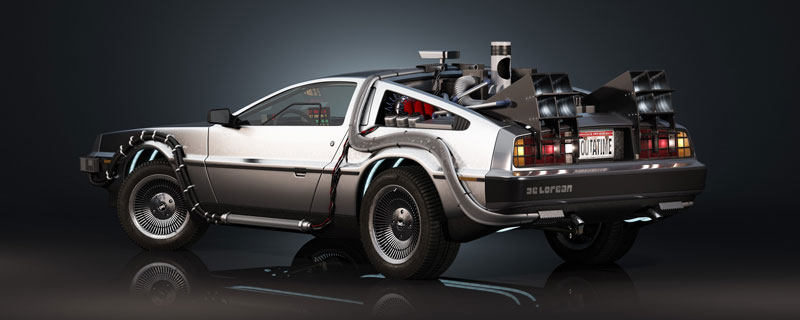
a Delorean
6. Say no to pop-ups: Yes, pop-ups will driver customers away just a bit faster than background music. Even if your pop-up asks your customers to sign up for your coupons and newsletters, don’t do it. New customers want to look around first before they commit to anything, and returning customers don’t need to be asked time after time.
7. Don’t click here to enter: What’s the point of this really? It just gives customers a chance to hit the back button and never visit your site again. Don’t tease and allow a “click-to-enter” page, just get to the good stuff.

8. Confusing Content Layout: Content is what helps bring customers to your site, but if it’s unorganised or difficult to read, they won’t stick around for long. Be sure your content is readable and broken up into several paragraphs. Bullet points and numbered lists are easier on the eyes than big blocks of texts. In addition to making sure your content is relevant, be sure readers can also get through it.
9. Useless graphics: Photos, infographics and other images bring a pop of colour to your website, but do you really need 10 per page? More graphics means more loading time, and that might just enough time for your customers to get bored and visit a different site.
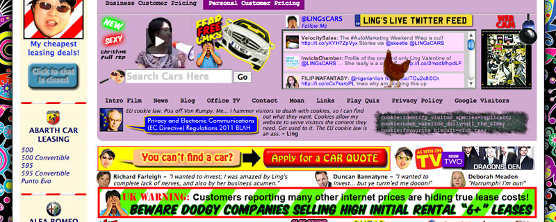
Too many buttons, too many things to look at.
10. Clueless navigation: If a customer is trying to get through your site to find a kitchen product, they would probably look in the kitchen section, but to get there, they have to go through home decor, choose products rather than furniture, then select the room, then finally choose between large appliances and small appliances. Look, we get it, you’re trying to organise, but you’re making it difficult for your customer. Keep website navigation simple so they don’t get lost in the process.
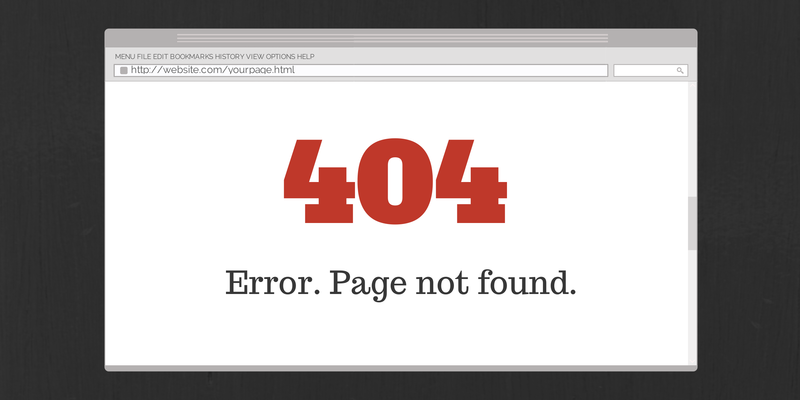
11. Discard dead links: There is perhaps nothing more frustrating than clicking on a link and being told the page is no longer there. Dead links look unprofessional, and customers often don’t trust a site with a bunch of dead links on it. Get your website together before it goes live.
12. Slow loaders: We touched on this briefly, but other facts can contribute to a slow loading page, such as an overseas or “backyard” site hoster or sub-optimal graphic formats. Every second your page takes to load is a second your customer could become fed up and click out of your website.
13. Poor monitoring: Even after you think you have all the kinks worked out on your site, you still have to update and maintain it. Content should be added once or twice a week to give users a reason to keep coming back, and you should be using tools that will help you see how users are getting to your site, whether it’s Google, social media or another source, and what you can do to better serve these customers.
14. Inconsistent pages: Some designers like to treat web design like haute couture fashion. Each page is an outrageous statement that no one will ever wear or read because seriously, who would wear that? Your pages should be uniform in style, and there shouldn’t be any distracting, loud designs that have no real purpose on the page. Keep everything clean and your users will thank you for it.

Where did the navigation go?
15. Rotten resolution: There’s nothing more annoying than having to scroll over on a page, using the horizontal scroll rather than the vertical one. Your customers probably won’t bother and will just click over to a different site for their shopping needs. Keep your website at the preferred optimised layout: 1024 x 768 pixels.
16. Painful registration forms: This is the part you really don’t want to mess up. You finally have interested subscribers, but if your registration process is too complicated, they won’t go through with it. Keep your questions simple. Ask for an email address and a name. If you send birthday coupons, a birth date is acceptable as well. That’s all you really need to keep in contact.
17. Test for responsive web design: You want a website that is viewable on every browser and on every device. Having a responsive design for your website ensures that all users will have access to the same great website no matter what device or browser they’re using.
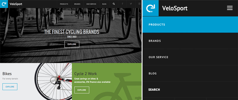
Nothing gets lost between the desktop and the smartphone on VeloSport Online
contributors