BLOG
4 Strategies to Boost Website Conversion Rate
No matter what your line of business is, your website should always be designed to sell.
Whether you sell hand-carved furniture or provide housecleaning services, your business website should look modern and promote your brand while making it easy for the customer to either buy from you or contact you for a service.
There should also be a line of marketing going through your site. The images and colours you choose should be reflective of your brand and illustrate how your product or service can make life better for consumers.
Your business website’s goal is to convert potential sales into returning customers, and the look, the feel and the processes your website implements makes a huge impact on conversion. If your website isn’t converting as many customers as you’d like, maybe you need a new strategy.
Check out these great website conversion tips and see what your site might be able to do better.
1 – Start with the basic web design principles
The design of a website can be an automatic indicator of quality to consumers.
Having a modern looking optimised landing page can make a huge difference! If the site looks too busy or looks like it hasn’t been updated in 10 years, consumers will notice and turn away. An inviting design and a fresh look might be all they need to stick around and check out what your site has to offer.
Website designing starts with the basics: colour, text and buttons. All three components work together to send the right message to consumers. Colours that are too bright will drive away customers, and text in Comic Sans font will only make users laugh.
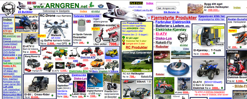
An outdated ecommerce site design
Colour
When choosing the right background colour and text font, always test them to be sure they complement one another. The background should be user friendly and not wash out the text.
Fonts
Stick to normal fonts, like Ariel and Times New Roman, for most of your text. Unless you have a solid reason for choosing something fancy, keep your fonts simple. You don’t want to put off customers just because they can’t read your text.
Buttons
When using buttons, make sure you’re issuing a call to action. Sites often fare better if they use “Order Now” rather than “Buy Now” or “Checkout,” but that’s up to you. Your buttons should also be in an easy-to-access place where consumers can click on them. Consumers who can’t find what they’re looking for or navigate your site will gladly go elsewhere for their needs. Make it easy for them to find what they need.
2 – Apply a clear marketing strategy
Having a great looking website is only half the battle when it comes to creating a conversion-inducing website. You also need to incorporate marketing strategies into the functions of your site.
For example, offer your consumers a free trial of your product or service to prevent choice paralysis, which occurs when consumers have too many options and can’t make a decision. They tend to give up all together because it’s easier than dealing with potential buyer’s remorse. Stop them from paralysing themselves by giving them a chance to try your company out for free.
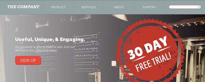
Give consumers a few different options and service packages so they can find something more tailored to their needs. Many businesses like to offer 30-day trials, so try offering 60 or 90-day trials. This will make you stand out from your competitors.
To help sceptical customers who would rather see your product in person, be sure your site shows off your product. For each product you sell, you should have a few images, all from different angles. This is especially beneficial if you’re selling clothes. A woman might love the design of a dress, but if the back is low cut, then she wouldn’t be able to wear it in an office setting. If she doesn’t know and buys the dress, it’ll probably end up being returned or with a bad review.
If you sell a service, show your product in action. Show your employees hard at work and include before and after images. Screenshots of software products should always be included so the consumer knows what they’re getting into.

3 – Write great web copy
All of your text should echo your business’ mission and goals. That’s pretty much the basic definition of what copywriting is. Having the best marketing copy is key to the success of converting sales.
Engage with the customer by addressing them as “you” or “your.” Try to avoid using any references to “I.” Put the power into your customers’ hands and provide them with interesting text that then grabs their attention and creates a desire for your product.
Be sure your text is streamlined for search engine optimisation (SEO). The text should be original and have keywords effortless placed within. Don’t try to stuff your text with keywords. State your business’ goal or mission and be direct when talking about your products.
4 – Offer the best customer support
Even though you’ve made every effort possible to help customers get from point A to point B on your site, there will still be plenty of customers with questions or in need of assistance. Don’t forget about them and their needs when you’re setting up your site.
When you’re in a store and you have a question about a product, who do you usually ask? It’s normally a passing sales person. On the Internet, however, you don’t have sales people wandering around the store, but if you include a Live Chat option that is open during regular business hours, you can mime this feature. Customers can ask questions and request clarification easily, which can help you convert more browsers to buyers.
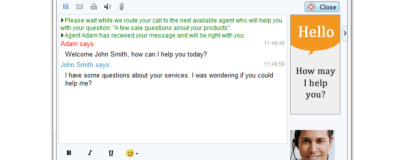
Live chat with a customer service representative. Image credit: MyLiveChat
You might not believe it, but there are plenty of customers who read through the terms of service and privacy policies, especially now that security breaches are becoming more of a risk. Try to simplify your terms and policy as best as you can without losing any of your own protection.
Don’t bother your customer’s with too much legal jargon. Just tell them how you plan to protect them in a straightforward fashion.
When it comes to building a strong website, there are plenty of minor components that can make a major difference in your sales. With the right conversion strategy, your consumers will enjoy coming to your site and will be sure to return often.
What changes would your website need to improve conversions? Let us know in the comments below.
