BLOG
Website Design Trends That Will Dominate
It may be hard to believe that another year is coming to a close, but 2015 will be here before we know it. In a world of ever changing website design trends, it can be hard to keep up with the latest happenings. However, it is critical to be on top of these changes so that you can stay ahead of your competition.
The following details just a few of the most important website design trends that will dominate in 2015 to give you a leg up in your industry.
Responsive design
In 2014, responsive website design became the new norm for Web design in general, particularly WordPress themes. Responsive design is an approach to Web design that offers an optimal viewing experience on multiple devices. It became the new norm seemingly overnight, but it is not likely to go anywhere any time soon. Mobile Web usage is well on its way to overtaking desktop Internet usage. This trend is only going to increase in 2015. If you haven’t adopted a responsive design yet, it’s not too late to implement one.
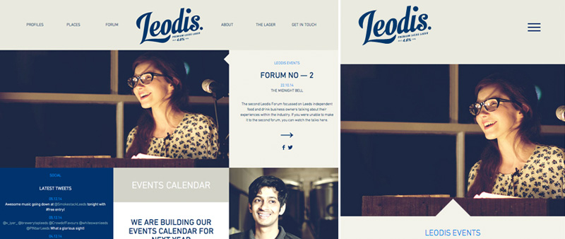
Leodis Lager‘s website adjusts the layout when viewed on a mobile browser.
Flat design
Over the past couple of years, flat design has slowly emerged from several major factions, most notably Microsoft, which uses it for the Windows 8 platform. You can also find flat design in Google’s new Material Design guidelines and many newer Apple products. While there are inherent issues with flat design in terms of user interfaces, it is generally agreed upon that it is a viable Web design technique. Flat designs are attractive as well as practical. With a streamlined, clean aesthetic free of clutter and other distracting elements, users can focus on the content at hand.
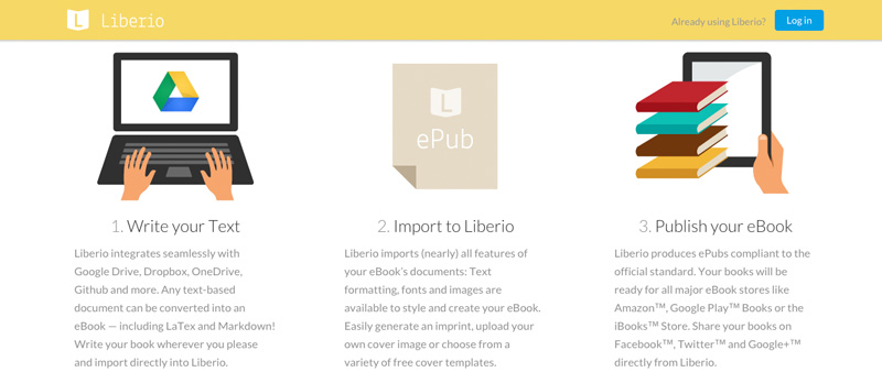
Liberio uses a flat design to convey their message of simplicity.
Flexible typography
Traditionally, beautiful fonts and typefaces have been costly, which means that you only saw typographic heavy Web design from large corporations. However, type kits are now readily available and often very affordable, or even free. This means that virtually anyone using a WordPress theme has the power to make a type-centric design look modern and professional. Also, as part of the move to responsive design, Web designers are finally making type responsive so that text no longer appears small and squeezed together as it has on many prominent sites for the past decade.
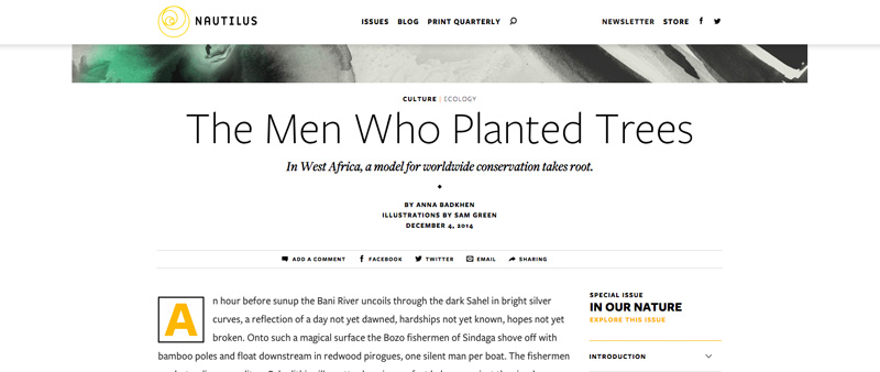
Typography helps in providing style and readability on Nautilus
Prominent high quality background images
Once upon a time, bandwidth limitations made it tough to display large images, particularly on homepages. However, as these problems diminish, new options are coming about for using images in website designs including extracting dominant colours for backgrounds, responsive resizing, and optimising images for minimum server load.
One of the simplest and most effective ways to create a distinctive website is to showcase stunning content. What better way to accomplish this than to display a large image for the background? You can use blur and colour filter overlays to “float” the text without hindering site usability. With the image as part of the overall design style or philosophy, it doesn’t feel like a gimmick. Instead it comes across as both powerful and elegant.
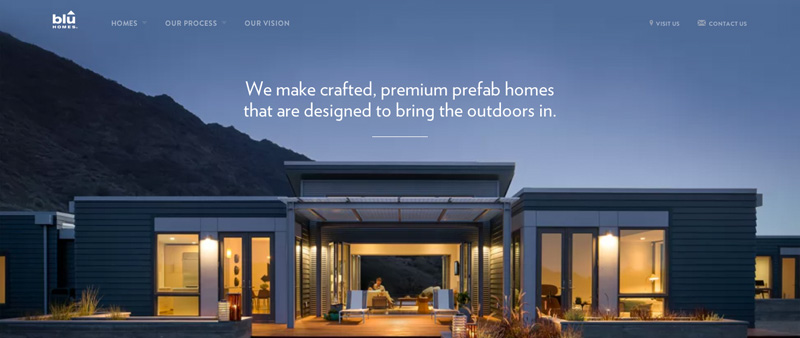
Blu Homes uses a prominent background image that is also a cinemagraph.
Scrolling animations
There has been such a surge in scrolling animations over the past year that most people don’t even realise how often they encounter them. These animations allow people to scroll instead of click to navigate through the content. With less page loading, transitions are smoother and information keeps flowing, increasing site engagement as much as 70 percent. Scrolling animations are particularly effective for product presentations. You can showcase your product in 3D, demonstrate its benefits, and tell a little story about it, all within a single page, reducing the risk of the user losing focus on the product at hand.

Brancott Estate Pioneers utilises the scrolling animation to tell their story.
Webgraphics
Over the past five years, infographics have become a popular method for sharing large quantities of complex information, notably data, succinctly and effectively. Recently, thanks to increased design, technical, and hardware capability, Web designers have taken this concept to a new level and started to use web graphics. Typically, webgraphics have more visual appeal than infographics and include interactive elements, which greatly increase user retention. When users have the ability to interact with graphics, they make discoveries on their own, which allows them to take away more from the experience. Infographics help people focus their attention while webgraphics use a narrative thread to walk users through the information and reach a conclusion.
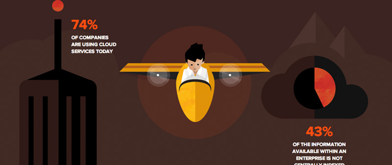
Atlassian uses a full infographic page to get their message across.
Are you concerned because your website isn’t up to par with these website design trends? Start with areas of your site that are most in need of updating. Then set up a schedule to address smaller issues over the following six months.
