BLOG
5 Tips For High Performance Landing Pages
Getting people to convert on your landing pages can sometimes feel more like an art than a science. It’s important to continue to tweak your landing pages in search of what works best for your audience.
If you’re giving away something of substantial value, it’s not hard to get people to convert.
So how do you get people to convert on your landing pages without giving away the farm? Start by following these tips.
1. Limit distractions
It’s an established fact that distracted people don’t convert. Streamline your landing pages by removing unnecessary elements like:
- The navigation menu from dedicated landing pages
- Image sliders
- Pop ups
- Extra columns or sidebars
You should, however, consider:
- Keeping live chat and making it proactive
Dedicated landing pages are pages where people end up as a result of clicking one of your CTAs either on one of your web pages, blogs, or emails. These pages aren’t really part of your main website and are built with the sole purpose of converting people who have clicked through to them.
Live chat can be seen as a distraction so use it wisely. Use smart logic to initiate a chat when people seem to have stalled. They may have started to fill out the form and stopped for some reason. That point in time is your chance to prompt them with a light nudge. This is often called proactive chat.
2. Clear & strong value proposition
Getting people to convert involves conveying an understanding of the value of the offer. Value doesn’t concern the monetary cost or any discount you’re providing in this sense, but refers to what someone will gain personally by taking up your offer.
Campaign Monitor’s homepage is a great example. They recognise that many of their customers are reluctant to take up another ‘tech’ challenge. Campaign Monitor make it clear that their product is really easy to use, and there’s no risk because you can “get started for free”. The value here is twofold: First, they’re going to make it easy so I don’t need to worry about the ‘tech’ challenge, and secondly, you can try it for free so there’s no risk.

3. Use eye catching and relevant imagery
People respond much faster to images than they do to text. Your images need to support your product, make people feel good about it, and they need to be relevant. I am absolutely sick of those bland stock images you see on every second website. All they do is disconnect you from the product, and it’s been known for a long time now that they don’t work.
Even in ‘boring’ industries, it’s better to use real photos of your staff or products.
4. Keep the form as short as possible
When you’re offering a ‘free’ download or trial or video (or any given piece of content), it isn’t really free, per se. People have to hand over their personal information in order to get your offer. This can be a real barrier for some people, so make it easier for them by not asking for more than you absolutely need.
For new leads, ask for the absolute minimum – this could be just their name and email address. You can always ask for more in subsequent conversions.
Some systems allow you to do this automatically by replacing form fields which have already been completed by known leads with fields they haven’t yet seen. Keep in mind that you should always show their basic contact information, name, and email, so they recognise their details and can change anything they need to.
The image below shows what a visitor sees on their first conversion and what a lead will see on a subsequent conversion. Note that the last two fields have been replaced automatically as they were completed during the first conversion.
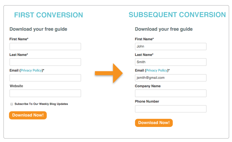
It’s also worth noticing the links to the email privacy policy in the forms above. An aversion to possible spam is a legitimate concern for a lot of people, and it can be a significant barrier to conversion. Make sure people can find out how often you’ll email them after they complete the form.
5. Make it mobile responsive
More emails are now read on mobiles and tablets than on desktops. What’s that got to do with landing pages? Well, the calls to action on your marketing emails are going to take people to landing pages, and if your landing pages aren’t optimised for mobile, you’ve lost these conversions.
The smaller space of the mobile screen puts up even more barriers to conversions. There is little room for your images and content and how far someone is willing to scroll down to complete the form.
It’s not good enough just to rearranged your page so it’s readable on mobile; you also need to consider content which you don’t need on mobile. You should also limit the form to just name and email on mobile.
6. Bonus tip: Test, Test, Test
Every landing page is different and the ‘value’ of the same offer to different audiences is different. You’ll have to experiment to find out what works for your audience.
If you have thousands of visitors to your landing page each month, then it’s worth using an automated A/B test system to create and test hypotheses. Test only one or two variations at a time to find the most effective changes.
If you don’t have as many visitors, make minor changes to your landing pages each month and track your conversion rates.
I’ve seen landing pages go from 10% conversion rate to 30% conversion rate with only a few tweaks to content and imagery so it really is worth testing.
ABOUT THE AUTHOR

Ken is the Managing Director at More Business Online. Ken is passionate about achieving results for his clients. “Online marketing activities, including websites, must provide a positive return on investment”. Ken has a solid track record in Online Marketing, SEO, SEM and Web Design. Prior to Ken’s online and web experience, he worked on various software projects, both for industry and in creating products for retail sale, and was the Project Manager and Principal Engineer for substantial engineering projects. Ken holds degrees in Engineering and Computing. It’s Ken’s engineering and project management experience which ensures that Ken takes a meticulous and data driven approach to Online Marketing projects producing excellent results for his clients. More Business Online is an agency based in Charlestown, Newcastle NSW, Australia providing Online Marketing Services, Website Design Services and Graphic Design Services. More Business Online specialises in the process of Inbound Marketing producing great results for their clients. Our goal is to deliver more business online for you.
