BLOG
Why Responsive Web Design is the Cornerstone to Any Mobile Strategy

In 2010, WIRED magazine’s Chris Anderson and Michael Wolfe declared in an article: The web is dead. Long live the Internet.
Now their words are finally coming to pass. CNN reported this year that mobile Internet usage has finally taken over PC and browser usage in the United States. This means that more people are accessing the Internet through their phones and tablets rather than using their laptops and desktops. Total Internet usage on mobile devices has beaten browsers before, but this was the first time that apps had overtaken the browsers.
So what does this mean for websites? Basically, more people are accessing the web on their phones and tablets, those little screens that can’t compare with a monitor. Therefore, websites need to be equipped to shrink and grow depending on where the user is.
Thus far, designers have taken two different approaches to this problem. Some are implementing responsive web design, which uses the same site across all devices. Other designers are opting for two sites: one for a browser and the other for a mobile site.
So which one should you choose for your company? We highly recommend you choose responsive web design, and we’ve got the proof to back it up. Check it out below:

Social Garden website displays the same experience for all browsers
Our Lord Google Decrees It So
Google has plenty of influence when it comes to search marketing strategies. The company has a 67 percent search market share, more than half of all search engine traffic across the web. When our lord Google speaks, everyone listens and obeys.
Google has advocated for responsive web design and recommends it for mobile configuration with its application (app). The company further states that responsive web design is in fact the industry best practice.
So why does Google advocate so insistently for responsive web design? It’s because these types of sites have only one URL and the same HTML, neither of which change regardless of the device being used. This makes Google’s job much easier as it crawls, indexes and organises information and content. If sites have different URLs and HTML coding for browsers and apps, Google has to crawl and index these as separate versions, though they’re all still the same site.
Multiple sites also bring down your SEO. Imagine a user shares a link to your site on the Facebook app. A browser user then clicks the link. The link will be the app site, not the fully-flushed out browser site, which might be vastly different from the browser site. Users might strongly prefer one over the other. As Google now takes user experience into account when ranking sites, this could seriously hurt your SEO.
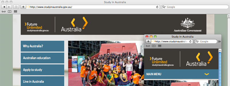
studyinaustralia.gov.au is consistent across different-sized screens
One for All and All for One
Having the same design across all types of computers, phones and tablets means your users will be able to rely on consistent, high-quality access no matter what type of device they’re using.
This is especially useful for you customers who use multiple devices throughout the day. If your site looks different on phones and computers, the user might become frustrated or annoyed when they can’t find what they need or where they were earlier.
This also prepares you for the future. Apple releases new versions of iPods, iPhones and iPads almost every year, which means screen sizes may shrink or grow. Samsung’s popular Galaxy phone has also grown in screen size over the last few models. If you have a responsive website design, you won’t have to worry about matching these screen sizes while retaining the quality of your site.
Less Time Spent Managing
If you have multiple sites, you’re going to have to have separate SEO campaigns. It’s hard enough managing one site, but can you imagine customising two sites and two campaigns? What works on a browser site might not work on a mobile site, especially if it’s long-form content.
This is easily the biggest advantage of responsive website design over multiple sites, but you should have a mobile SEO strategy, which tailors to keywords more likely to be searched on a smartphone. Think “on the go” type words.
It’s clear now that having two sites is holding you back and hurting your SEO so the best thing to do is create on responsive web design site, but this does require some additional programming and coding work. Read on to learn our best tips for creating the best design for your company.

jobsearch.gov.au doesn’t show huge images on smaller screens
Show the Best, Hide the Rest
We’ve already discussed how important it is to make your website design fit for multiple screens. It also helps to hide irrelevant content and bring out the more important aspects of your site. Now we’ll talk about how to achieve this.
You can easily hide content by adding the CSS property content. This will enable you to hide a block of content by narrowing down the viewpoint as per given width.
Collapse Your Content
You can also shrink down your content so it will fit better on the screen. Rather than hiding the content, you can collapse it instead.
To do this, you can hide the content apart from the header. Then let the user have the freedom to tap or click the header to show any of the content that was hidden. They can click again, and the content will be hidden again.
You’ll need both CSS and JavaScript in order to make this happen.
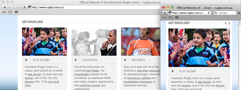
rugby.com.au collapses their slider content for easier reading
Reformat Images
You always want to be sure your images are scaled correctly for your site. This means the viewer will be able to see the image clearly, and it won’t take up the entire screen or be too small to see what it is. Though scaling for browsers is a fairly easy task, it requires a little more work for responsive web design sites, but it’s definitely worth the effort.
When working with an image, add a CSS that is maximum in width and as per the element. It should provide a percentage value to the property as well. This will allow the height to change with any screen while retaining the image aspect ratio.
Matt Cutts answers the question: “Is there an SEO disadvantage to using responsive design instead of separate mobile URLs?” via Google Webmasters.
contributors


