BLOG
5 Common Website Design Mistakes
Website design dictates the success of the entire site. Many companies get so caught up in creating content that the presentation often takes a backseat. You can have the best content in your industry, but nobody’s reading it, it doesn’t matter.
A well designed website isn’t about making your Web presence nice to look at. It’s about generating leads and sales. If you’re having trouble attracting online traffic, there may be some key flaws with your website design.
The following details five of the most common website design mistakes and how to fix them.
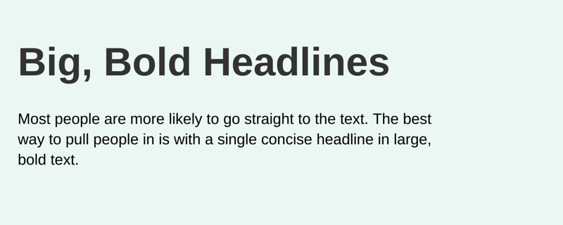
Weak headlines
On average, eight of out ten people read a headline. Only two of those ten people go on to read the rest of the content. As such, it’s not hard to see why a headline plays a large role in the effectiveness of the entire page. The better your headlines, the better your chances are that people will make it past that first line and keep reading.
Big, bold headlines are proven to capture even more attention than images. As the Internet is flooded with flashy advertisements, users have learned to tune them out completely. Most people are more likely to go straight to the text. The best way to pull people in is with a single concise headline in large, bold text.
Unapproachable content
Using shorter line length at the top of a page, or even shorter sentences, makes people more willing to approach a post. You’ve pulled them in with a great headline. Now you have to get them to finish the content. Make the beginning of the article about the reader. What benefits will they get from reading the content? What can they learn from it that will help them solve a problem? For example, start with a lead-in and several quick bullet points (i.e. increasing customer loyalty… yields substantial long term profits, is more cost effective than finding new customers, and creates loyal fans that spread the word about your products and services for free).
Intimidating or unreadable layouts
If a user has arrived at a website that contains the information that he is seeking, won’t he make some extra effort to get through the content? The short answer is no. Online users have a very short attention span and can’t be bothered to muddle through text that is tough to navigate. Imagine your frustration at finding just the right page for some research that you’re doing and having all of the text appear in one big block with no paragraphs. Aren’t you likely to give up and try to find another resource? You don’t want users to have this attitude about your page.
The good news is that if you’ve already got great content, it won’t take too much effort to format it. Changing the font size and color, breaking the text up into paragraphs, and adding relevant images and videos can mean the difference between users going elsewhere and users relying on your site as a go-to industry resource. You don’t want to skimp on these details.

Too many choices
It can be easy to assume that it is always better to have more choices. However, people get overwhelmed when making a selection is too difficult. Have you ever stood in the aisle of a store and had trouble picking out a beauty product because there were 20 very similar options? If you had just four choices, it would be easier to pick one. Having more people checking out your product with less people buying it is an issue. Focus on the best products from your line-up and showcase them on the homepage.
Underuse of photos with people and image captions
Most people are drawn to photos of people. Human faces create a sight line that people unconsciously follow. Think about using a human face with a speech bubble or a person pointing to a billboard. Additionally any time that you use an image on your website, make sure that you include a caption, as captions are some of the most read copy online. If you have a great punchline or witty remark, you should actually save it for the caption.

Have you found yourself making one or more of these mistakes? You can take comfort in the fact that you’re not alone. Even with the best of intentions, it is easy to fall prey to common website design errors. Recognising your mistakes is the first step toward fixing them. Prioritise your areas of need and then tweak other weak areas of your website as you can.
contributors