BLOG
Back to Basics: Why do I need a mobile version for my business website?

Have you ever actually pulled up your business website on a mobile device? Most business owners view them with their laptop and desktop browsers so when they finally view it on their smartphones and tablets, they usually get a nasty shock. The images are distorted and the text is miniscule, and that’s if you’re lucky. Many sites are too big to even load on a mobile device. You might think that no one would shop on a mobile device anyway, but you’d be surprised at how quickly the app is overtaking the browser in terms of search ability. Plus, there are many other reasons why having a mobile version of your site is beneficial. Check them out below.
Apps are appealing
No one would have thought the app would ever overtake the browser, but in January 2014, mobile apps overtook PC Internet usage in the United States, which hadn’t happened in any previous months. That’s a huge market that is searching for products almost exclusively on their phones and tablets. According to an article from CNN Money, 55 percent of all Internet usage in the U.S. came from mobile devices, 47 percent from apps and eight percent from mobile browsers. Only about 45 percent of Internet traffic came from PCs or Macs. So what does this mean for you? It means that fewer and fewer people are using traditional computers to shop and search for businesses. They’re not viewing your site on browsers, not even on mobile browsers (don’t forget, that only equaled eight percent of that 55 percent). If your site is unreadable on a phone or tablet, you’re not going to get many visitors.
Mobile versions please Google
In reality, almost all web designs and keywords are chosen entirely to please our overlords at Google. As the search engine company controls about 70 percent of the market, when Google says “Jump,” web designers jump, and then do a flip for good measure.

Church St. Enoteca has a responsive website for easy access anywhere.
Google’s search engine algorithm ranks mobile-friendly sites higher on their app search results. Even if your link profile is excellent and you’re regularly updating your site, Google will still send websites with mobile-friendly websites ahead of you in results. Most of those sites have what is known as responsive web design, meaning they have one website that is designed to be accessed on any device. This requires a certain type of coding, but even for novice web designers, it’s not a difficult concept to grasp. Sites without responsive design have to make individual websites for each type of device, which makes more work for Google because it has to catalogue each site. Therefore, Google rewards those who make life easier for it by pushing those sites higher in search results.
Easier to find you
Let’s say you have a cafe in a marginally large, tourist city. You have a lot of competition and a lot of foot traffic going around. Tourists looking for a great cafe will search for nearby hotspots on their phones. If your business website does not have geolocation activated, those hungry tourists will go straight to your competitors.
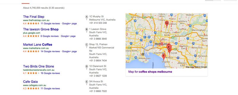
Google results for “coffee shops, Melbourne” show businesses with geolocation at the top.
Geolocation is mainly a Google feature. When someone types “coffee shops, Melbourne” into their Google app, Google will pinpoint the exact location of several coffee bars in the area, usually within a five mile radius. This is extremely helpful for lost tourists or city dwellers in an unfamiliar area of town. There are some forms of social media, such as Foursquare and Facebook Places, that allow users to “check in” at the locations they visit. Google Places for Business is routinely ranked higher in search results. By using one or more of these platforms, consumers looking for your type of business can find you much easier and visit your establishment.
Mobile purchases and immediacy
When you’re looking at a product on your laptop or desktop, you see a wide picture with margins full of information. On one side, you have product reviews. On another, you have more similar products flashing across the screen. It’s a busy screen with plenty of opportunities for customers to be persuaded not to buy a product from you, whether it’s a bad review or a different product.

Albert Park Deli’s website displays easily on mobile.
However, on smaller, mobile screens all of that information is usually not available because it can’t fit. This often stops buyers from second-guessing themselves or doubting their purchase. Negative reviews are not so readily on hand, and other products do not flash across the bottom of the screen. Research shows that:
- At least 55 percent of customers on mobile devices want to make a purchase within an hour’s time. That’s pretty fast!
- Eighty-three percent of them want to make a purchase within the same day.
That’s a massive amount of business you could be missing out on. If your website is not mobile-friendly, you can bet this fast-purchasing market will look elsewhere for its needs.
Usability reigns supreme
If you still aren’t convinced by all the data we’ve discussed thus far, then consider your customer’s needs, wants and, above all else, patience. Needs and wants will always vary between customers, but patience for slow-loading web pages is highly limited. A site not designed for mobile devices will be incredibly slow, almost at dial-up speed. Your customers won’t bother to stick around and check out your products if the site doesn’t load fast enough.
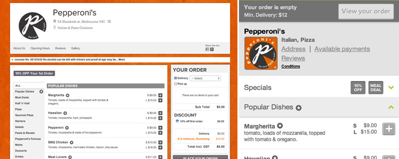
Pepperoni’s recognizes if you’re on a phone and redirects you to their mobile ordering site.
Even if it does load, is the site easy to navigate? How does the check-out process work? Consumers who can’t get around your site won’t wait until they get back to their laptops. They simply won’t return to your site. Your business loses credibility when your customer become aware of how out-of-touch you are with web design and technology. Don’t forget, technology is not done changing. Since the first iPhone came out in 2007, its screen size has changed considerably. Soon iPads and tablets became popular, all with different screen sizes, and then Apple released the iPad Mini. Those are all vastly different screen sizes that will show your unresponsive website in a variety of confusing and painful ways. With a responsive or mobile version of your site, it will always adapt to fit any screen size, no matter what the future holds.
contributors


